Snapfactory Publishing
Brand, Identity, Logo
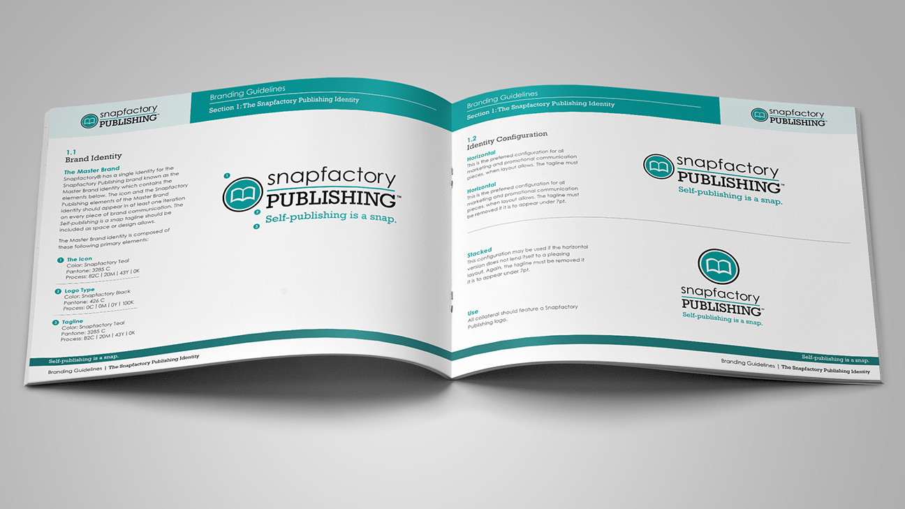
The fall of 2011 saw the expansion of Snapfactory studio’s creative services to include digital publishing. The boutique, self-publishing arm of Snapfactory needed an identity that respected the existing brand while informing writers of the approachable, easy-to-use nature of the agency’s services. The color, typography, and the circular theme of the Snapfactory logo served as the inspiration for elements used in the Snapfactory Publishing identity.
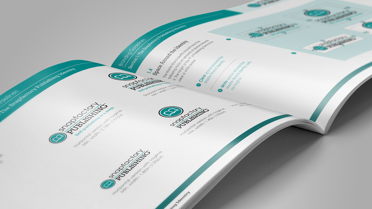
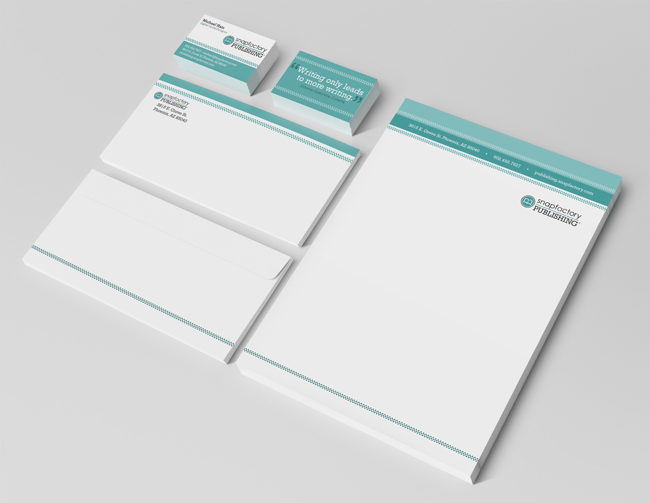
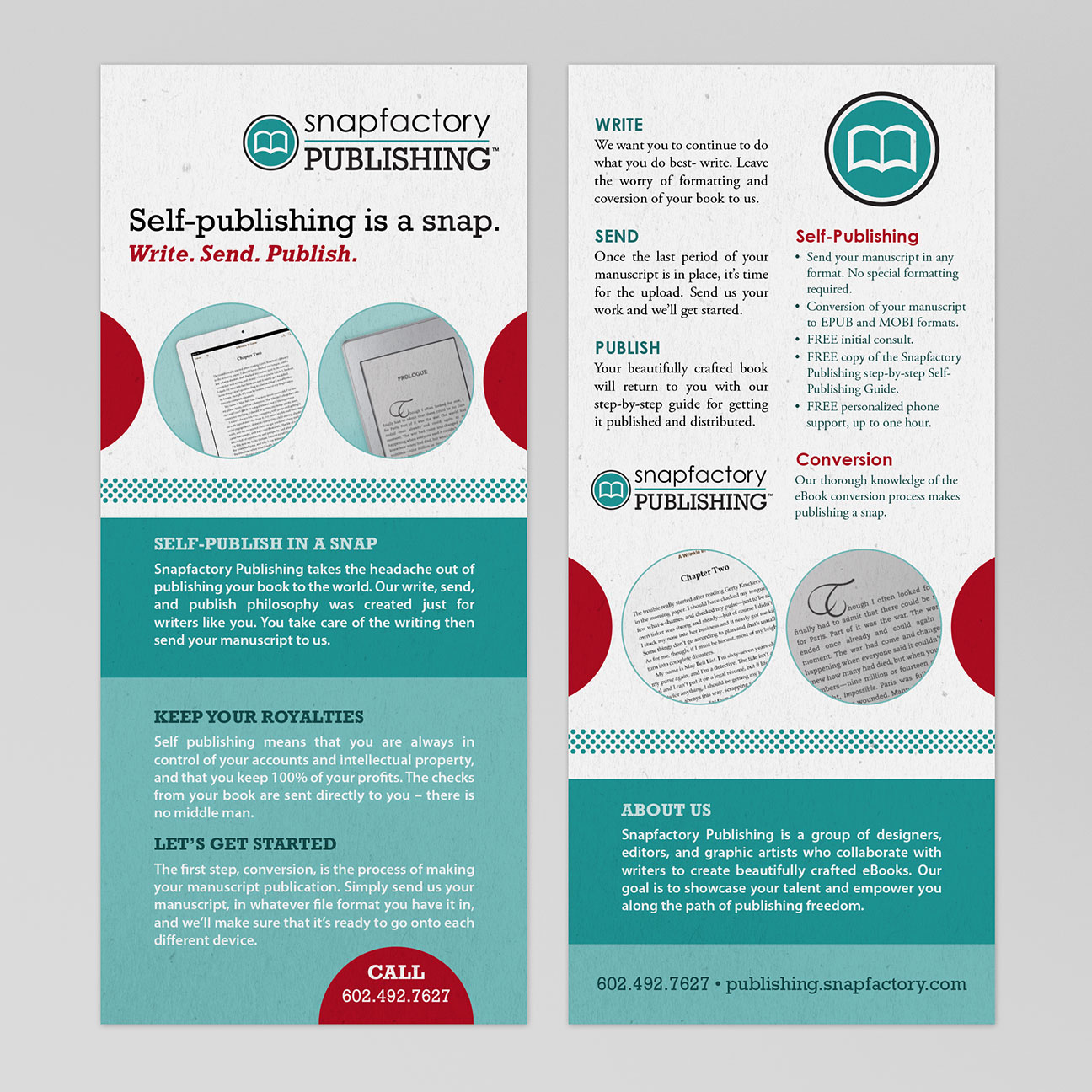
The crisp, modern lines of the original Snapfactory logo’s typography have been anchored with a mechanistic, slab serif typeface. Hues of Snapfactory teal are juxtaposed with splashes of candy apple red in the marketing collateral to draw the focus of the eye. Brand identity guidelines were created to maintain consistency for subsequent marcom and to provide direction for future designers.